The Logo consists of 3 elements, based on the letters M, L and O, standing for the MARKUS LEHNER ORGANISATION.
1. The M could also be seen as 2-times the number one, which gives my lucky number 11.
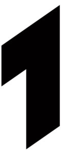
2. The angle between the main guiding lines are two times 110°, hence – if “0” does not count – 11.11.
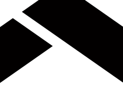 3. Especially the M (or the 1s) is very clean with sharp lines, no curves and no bends, all straight – A real hard liner!
4. The L is larger than the M since it is representing my family (name) – more important than the M representing me. And the O, standing for our Organisation, is all around preserving and looking after us.
5. The L is standing very firm on solid feet, like (hopefully) my life and (definitely) our organization.
6. The top-head of the L is fitting in perfect harmony with the O, like our family with our organisation.

7. The shape of the O was also inspired by the very first investment company important to me, see below:
8. The O is flat at the bottom to avoid rolling away and even going upside down by holding ML.
9. The dimensions of the width are like my life: ML is the benchmark, O is 3/4 and free space is 1/4 of ML.
10. Some people see a fast walking man in the Logo, others see a rocket on take-off or also an aircraft in flight.
11. Fewer see similarities to a German industrial corporation and/or the world-wide known sign for peace – which is also absolutely fine with me 😉
